Logo
A vibrant emblem we share with the world.
The logo reflects our identity and bridges our history and future.

Introduction
The logo consists of an iconographic element within the verbal designation itself. The iconographic element symbolises power, connectivity, and innovation.
Its minimalist design represents seamless functionality and modern technology, reinforcing the brand’s commitment to efficiency and forward-thinking solutions. As a universally recognized symbol, it conveys accessibility and user control, making it an integral part of the logo’s visual identity.
Clear space
Clear space is the necessary area surrounding a logo to enhance its visibility, impact and visual integrity when coexisting with other graphic elements. No other graphic elements may be present within the designated clear space.
To establish the minimum clear space, use the logo’s iconographic element as a reference when positioning it within layouts or near other elements.
Scale
When scaling the logo, always ensure the legibility is not compromised.

Minimum size
On screen
Logo height is 20px
In print
Logo height is 5mm
Primary Usage
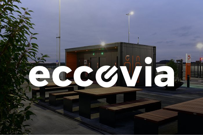
Whenever possible, we use our traditional 2-color logo, particularly in situations that demand strong brand recognition and trust. This includes our homepage, transactional emails, and financial applications.
Secondary Usage
On colored backgrounds, the logo should be used in white or black, with the choice depending on the highest contrast. Over dark photography, we use white for max contrast and legibility.
In the case of photographs with lighter backgrounds, our Black logo may provide better contrast – please use your best judgment to ensure legibility.
Brand partnerships
For brand partnerships, we display both our logo and our partner’s logo, separating them with the “icon” on graphic devices. The space between each logo and the “icon” should be half the clear space of eccovia’s logo. When adjusting the logo sizes, begin with the eccovia logo and then optically adjust and center the partner logo to achieve visual balance.
Incorrect use
Shadows or outlines must not be applied to the logo. The logo cannot be rotated, distorted, used in outline form, or as a mask for images. The colored version must not be placed on a similar color.
Don’t outline the logo.
Don’t apply shadows to the logo.
Don't use the logo in unapproved colors.
Don't apply color to the logo on the same background color.
Don’t apply color to logo over approximate background color.
Don't make the logo partially transparent.
Don’t rotate the logo.
Don't distort the logo.
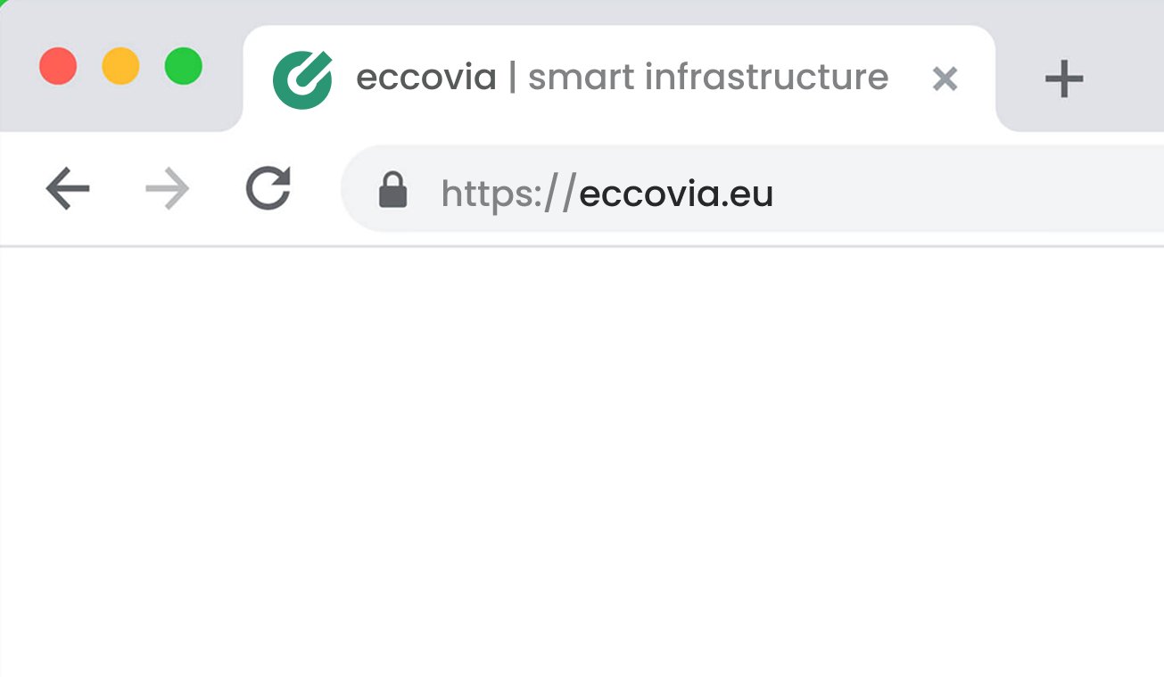
Symbol/Favicon
Whenever it is necessary to use a reduced version of the brand, it must correspond to the iconographic element of the logo.
For the website favicon, the symbol should be using all the space around it:
For an APP, we need to establish the minimum clear space around the logo which is the “x” measurement that we can see in the picture. Please use it as a reference when positioning it within a frame.